The Problem
Ility had a very basic style-guide with fragmented components focusing mainly on a few interactive elements like buttons and tables. It was no where near enough to constitute a design system that could produce consistent brand agnostic cross-platform experiences, at scale.
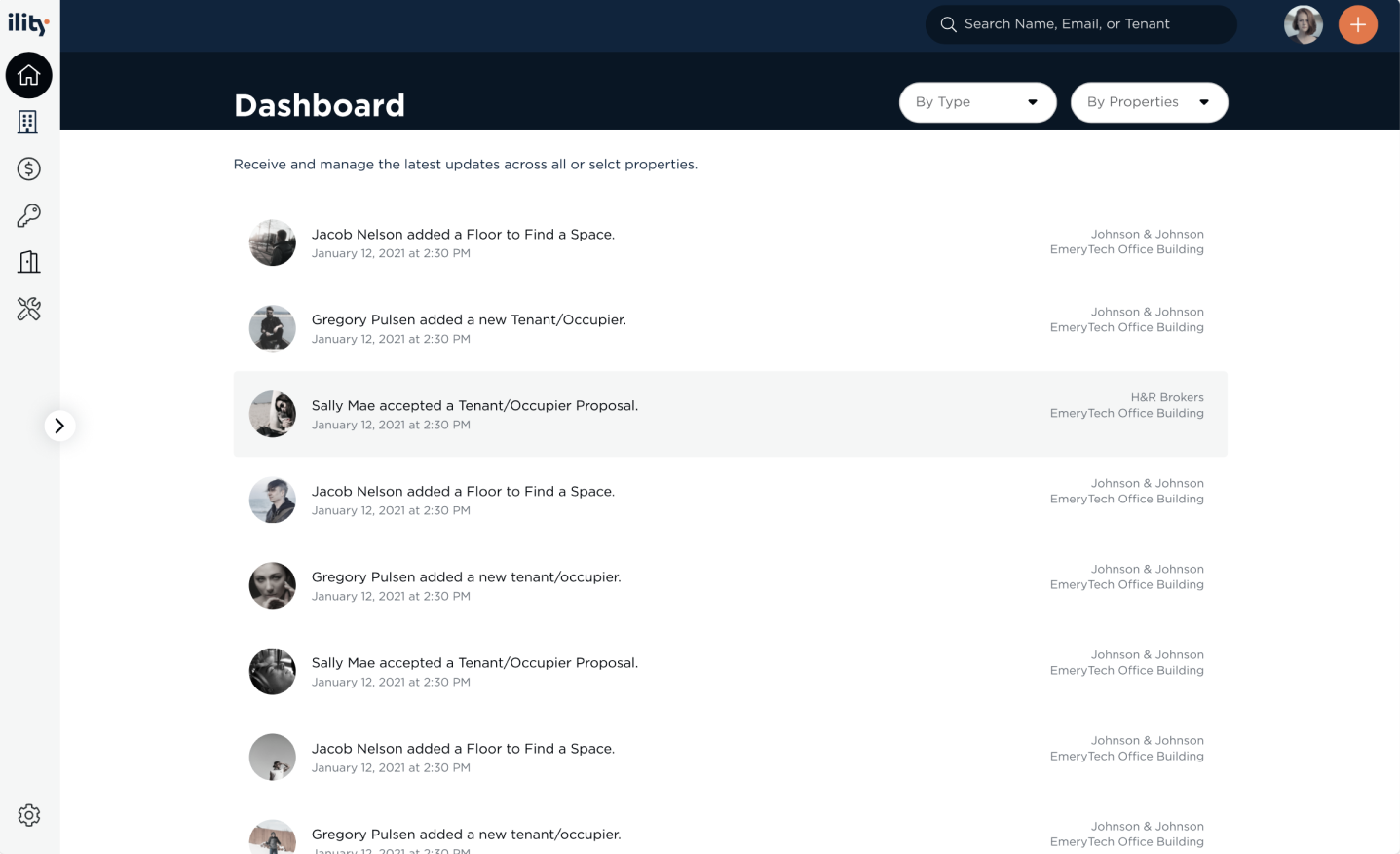
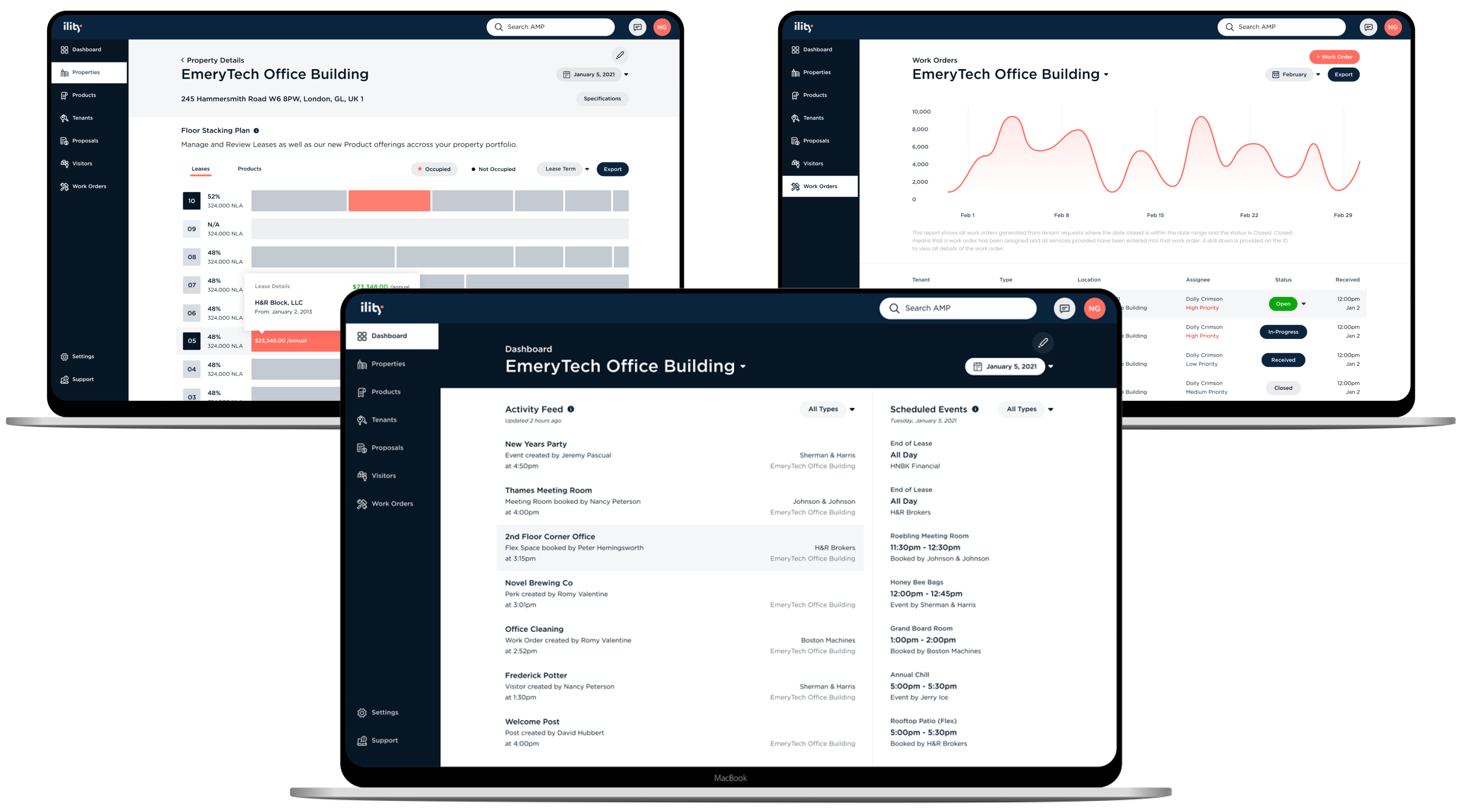
As Ility ramped up their expansion in commercial real estate; the engineering and product teams had to go through a strenuous manual administrative process to add client data and offerings into their Asset Management Portal due to the tool's poor usability. These disjointed workflows were costing the company thousands of dollars worth of skilled worker hours using broken systems only manageable and understood by them.
As a SaaS company, Ility needed a tested design system and modular platform with an enhanced user experience that could be utilized across any organization and the variability in their core offerings.
Role
Lead Product Designer
Solutions
Product & Design System
The Strategy
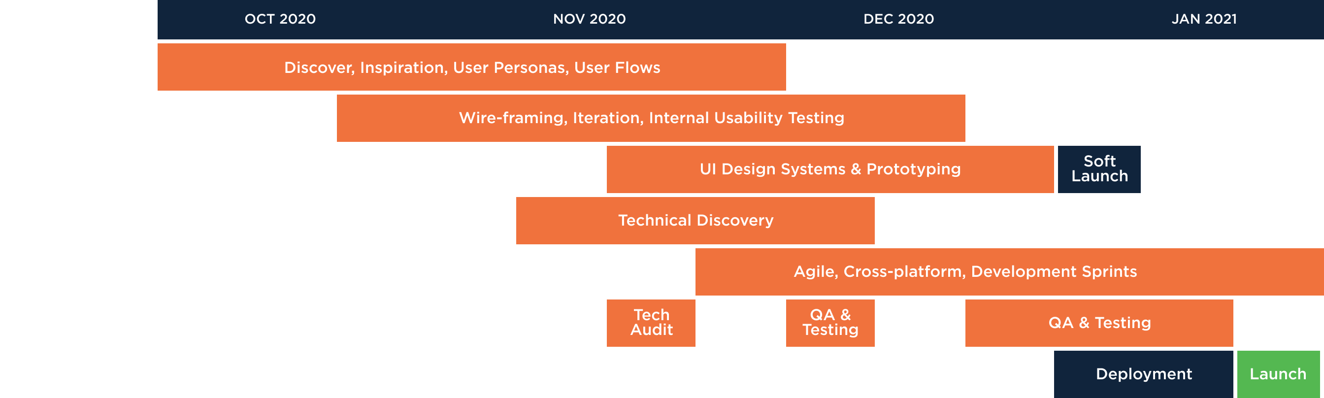
After a detailed audit of their existing system, several brainstorming sessions, and weekly calls with the engineers; I aligned product and engineering teams to engage in a parallel three month approach where back-end and front-end consistently and effectively caught up to usability testing and iteration loops.
The Framework
During the discovery phase, we followed Nate Baldwin’s framework which uses a slightly more theoretical “truly linguistic” approach. We wanted to set rules and guidelines that heightened the level of usability and harmony across the Ility digital ecosystem. This framework allowed us to document, validate, and tokenize each design decision (e.i. color, fonts, spacing, layouts, drop shadows, break-points, etc.) to ultimately create a fluid user interface that could work with virtually any company's brand guidelines.
The Vision
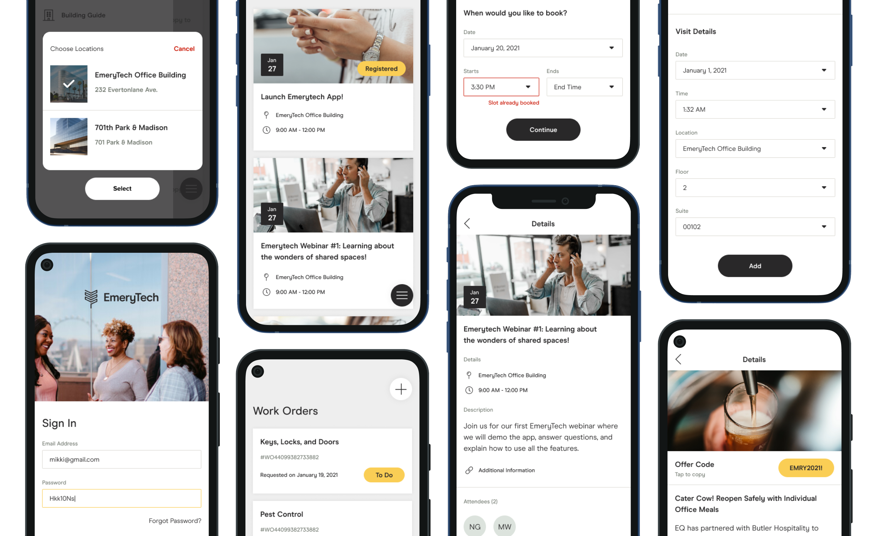
Reviewing the desktop and mobile experiences with a fine-tooth comb was only the beginning. Ility's business model revolves around having the ability to rights manage any interaction a tenant might have with the property. This concept gives landlords the ability to control and monetize any amenity, product, or intangible offering.
The million dollar question then became; if a meeting room, tables, and the wifi can all be itemized in the system, what exactly constitutes "a single unit" when applied to Net Lettable Area and Gross Area? An imperative attribute to understanding property value and depreciation.
This is where the concept of "stock" and "product types" became integral in understanding how to remain scalable, consistent, and logical across the back-end and front-facing products.
Testing & Iteration
After designing the team's "ideal" version of the platform and a few rounds of user testing, my suspicions turned reality when we realized that no matter how usable a component was; making drastic changes that broke away from existing user behaviors, created more pain-points than functional solutions.
In order to not jeopardize our timeline, we decided to iterate from polar-opposite sides, inward. The convergence point of our approach resulted in an optimal user interface with a design system that was feasible, met business needs, and aligned perfectly with the end-users.
The Design System
Finding the perfect balance between speed, accuracy, and consistency became second nature as we built visual logic around "tokens". This allowed both product and engineering teams in reintroducing themselves to the ins-and-outs of the Ility ecosystem, which we would then document and review in JIRA and Confluence.
Once the engineering team finished coding style-sheets with reusable tokens, we moved on to forms, then components, then navigation, etc., always being guided by clear standards. At this point, production was a breeze and we no longer had to account for the variability found in screen size, pixel density, or even orientation.
Monthly usability testing continued to weed out any outliers and edge-cases but after the release, all teams knew exactly when and how to use the new and improved modular design system.